
There are times when you want to understand "which value combinations frequently occur for a certain item" when comparing another item. For example, by arranging two values that represent operating conditions, such as rotation speed and torque, you can see the areas where the item is likely to remain (areas where the item is likely to occur). Using Echart's Frequency Analysis 2D, you can aggregate the number of occurrences for each value combination and visualize the frequency using the size of the bubbles. This article summarizes the steps to create a frequency bubble chart and how to configure it.
Key point: Data frequency is represented by the size of the bubbles
The steps to create a frequency bubble chart in Echart are as follows:
- Select the items to place on the horizontal axis and the vertical axis to display a scatter plot (points).
- Apply Frequency Analysis 2D and reflect the number of occurrences in each area in the bubble size.
- Adjust the grid spacing, minimum frequency, and maximum bubble to make the frequency distribution easier to read.
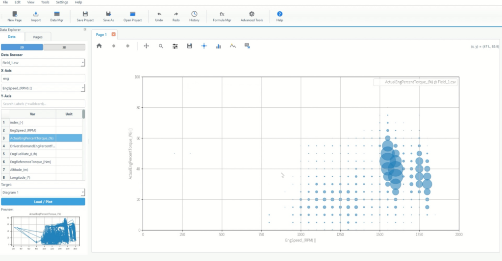
The important thing to remember here is that the larger the bubble, the more data there is in that area . Even with continuous values like driving data, frequent combinations are emphasized, making it easier to identify patterns.
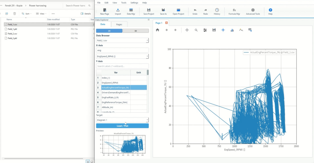
Step 1: Load the data and plot two items
First, create a scatter plot to use as the basis for the calculation. Since Frequency Analysis 2D calculates data using the distribution of points, it is important to first display the data using two items as axes.
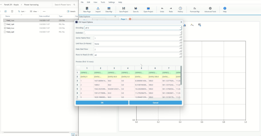
1-1. Load data from Import
- Select Import from the ribbon at the top of the screen
- Select the import format (CSV/Excel/TSV, etc.) and specify the file
- If you have a header row, adjust the header settings in the import options.
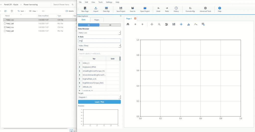
1-2. Select the items to use for the horizontal and vertical axes and plot them.
- Select the target file in the File section on the left
- Select the item to place on the horizontal axis in X-Axis Source
- Check the items to be placed on the vertical axis in the variable list.
- Click Plot Data to display it.
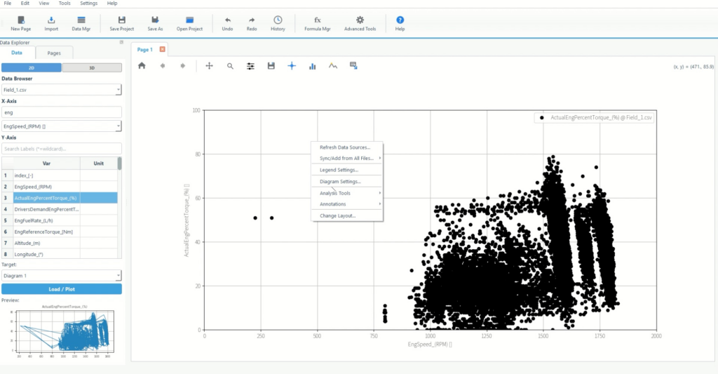
Step 2: Display the data as points and bubble the frequency using Frequency Analysis 2D
Next, set the display and aggregation settings. For frequency analysis, the display range is divided into a grid, the number of occurrences in each square is calculated, and the result is converted into the size of the bubble.
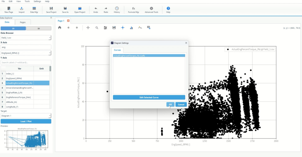
2-1. Edit the target trace from Diagram Settings
- Right-click on the graph
- Open Diagram Settings…
- Select the target trace (item on the vertical axis) and open Edit Selected Curve
2-3. Select Frequency Analysis 2D in Math
- Open the Diagram setting menu and open the Scaling/Math tab.
- Select Frequency Analysis 2D from Transformation .
- Frequency analysis settings (grid spacing, minimum frequency, maximum bubble, etc.) are displayed.
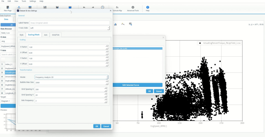
1) Grid spacing: what range counts as "the same area"
- The grid interval is a count of the number of data points between the grid intervals, in the sense that it counts the data.
- Making it smaller will give you a finer distinction, but it will also create more bubbles and make things more messy.
- Increasing the size will make the trends more coherent and make it easier to identify the main areas of stay (areas where occurrences are likely).
2) Minimum frequency: Remove areas that are too rare from the display
- The minimum frequency is a value to hide areas with a count below a certain value.
- It is effective when there are many sparse areas and the overall image is rough.
- If you prioritize understanding patterns, cut out the low frequency areas and keep the main areas.
3) Maximum bubble size: Adjust the emphasis on frequency differences
- The maximum bubble size is the upper limit for how large the bubbles in the most frequent regions can appear.
- If the frequency difference is difficult to see, make it larger, and if the bubbles are distracting, make it smaller.
- The key is to make the size of the "most common area" clear at a glance.
Finishing touches: How to fix text that doesn't read as intended
Finally, we will organize the order of adjustments based on the goal of "visualizing frequency distribution."
There are too many bubbles to see the whole picture
- First, increase the grid spacing a little and reduce the number of areas.
- Then increase the minimum frequency and clean up the low frequency areas.
There are no visible mountains and it looks uniform
- Increase the maximum bubble size to emphasize frequency differences as size differences.
- Then, make the grid spacing a little smaller to match the granularity that will produce the mountain shape.
Small bubbles stand out and the main feature gets buried.
- Increase the minimum frequency and trim down to only the key areas
- Once you have decided on the main bubble, adjust the maximum bubble size to ensure visibility.
Summary: Frequency bubbles allow you to quickly identify "common combinations"
Let me summarize the main points again.
- Assign two items to the horizontal and vertical axes to display a scatter plot (points)
- Frequency Analysis 2D calculates the number of occurrences per area and reflects this in the bubble size.
- Adjust the grid spacing, minimum frequency, and maximum bubble to make the frequency distribution readable.
A frequency bubble chart is a way to intuitively understand which combinations are most common. Even with data that changes state, such as driving data, the areas that appear frequently stand out, helping you understand patterns.
What is Echart?
Echart is a data organization tool that allows you to read, visualize, format, and analyze data all on one screen. Because you can interactively adjust graph settings and conversion processes, it is designed to be well-suited for tasks such as frequency distributions, where you need to explore and organize the data.
We recommend starting with a free trial to recreate a frequency bubble chart using your own data and check how easy it is to read the distribution.
All features are available free of charge for 30 days.