Data analysis software: Echart makes it easy to visualize time series data.
After importing data, Echart allows you to display a graph simply by selecting a label and loading it.
Graphing Data with Echart
Graphing procedure
1) Import
Prepare the data exported in CSV / Excel (XLSX). The data is assumed to have the label name on the first line, followed by the units and data.
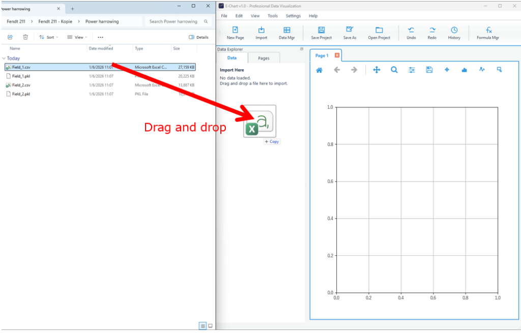
Launch Echart and drag and drop your data into the information panel on the left.
The data importer allows you to adjust the number of labels and rows of data to be imported.
The data importer will start.
A list of data formats supported by Echart will be displayed. Select the appropriate data format.
I will.
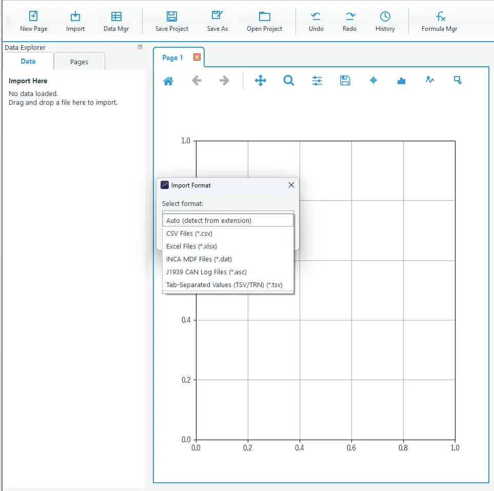
The data we will be loading this time is a CSV file, so when you select CSV, the following screen will appear.
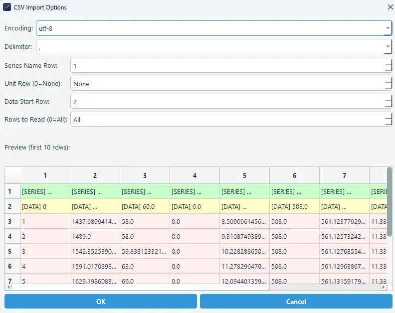
Set the data label, unit, and the row number where the data begins.
If nothing is displayed in the preview, it may be because the data format or delimiter is incorrect. Adjust the settings to get an appropriate preview.
When you select a file using Import, the data will be displayed in the Data Browser.
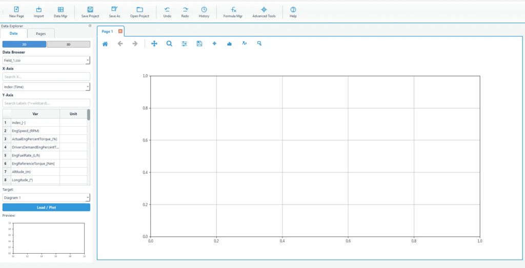
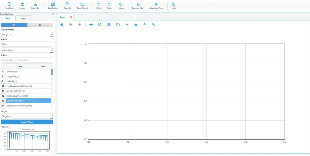
2) Select a label (searchable)
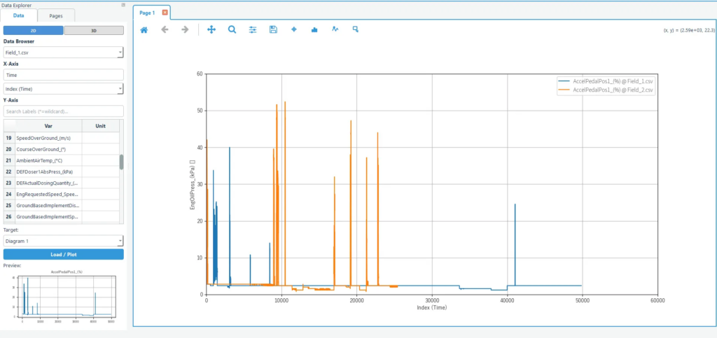
Select the label you want to display on the graph in the Data Browser.
Labels can be narrowed down by entering keywords in the search box. Select the X and Y axis values you want to graph from the list.
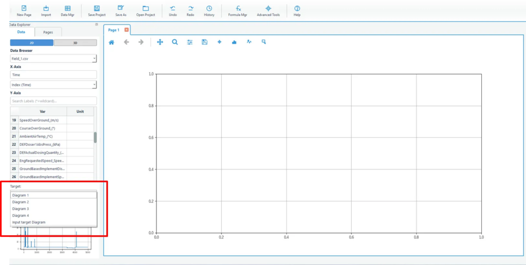
3) Select the desired diagram
Select the graph you want to plot.
Currently, only one graph is displayed, so select Diagram1.
4) Load
Press Load to plot the graph.
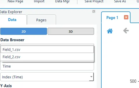
5) If you want to display multiple data in a graph, select multiple data and click Load.
If you select multiple labels and then load them, you can display multiple traces together in the same diagram.
This eliminates the need to create graphs one by one, as is done in Excel.
If multiple data are loaded, the same label names can be plotted all at once.
If you load multiple data, you can graph the same label names all at once.
Select the CSV file from Import as before and import it. This time, we imported the data called Field_2.csv.
Select the X and Y axes and press Load.
If multiple data are loaded and both data have the same data label, Load
You can choose whether to automatically add all data. Data that is unchecked will not be added.
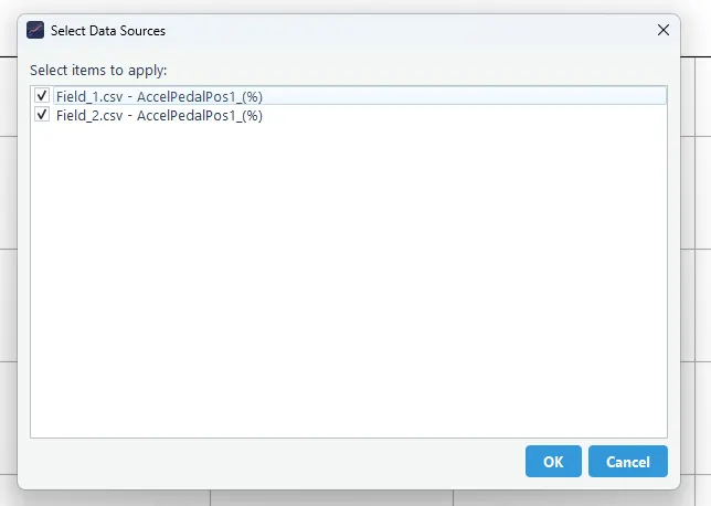
The data for the selected labels in both Field_1 and Field_2 are plotted.
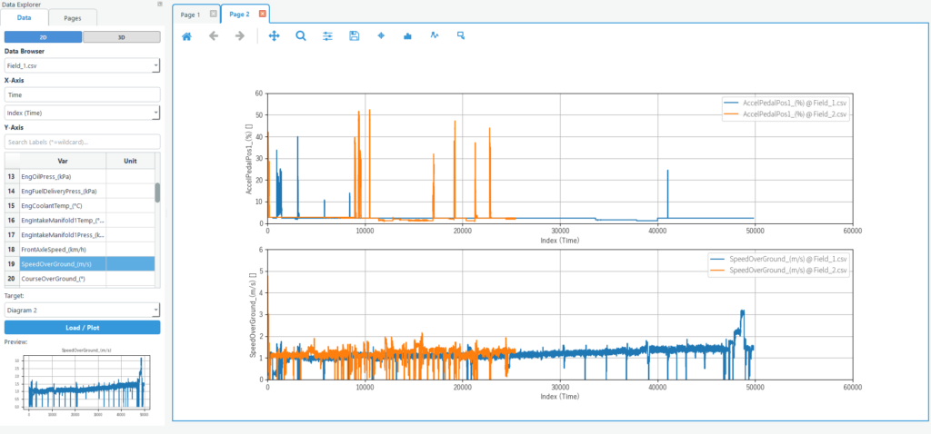
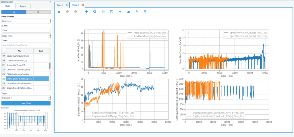
You can freely rearrange the number of graphs displayed on a page, as shown below.
Plotting graphs using time series data reduction software
What is Echart?
Echart is a data reduction software designed to simplify time series data processing.
If you find it tedious to create graphs of time series data in Excel, try out Echart’s easy plotting features with the free trial version.
All features are available free of charge for 30 days.
FAQ
Q1. What file formats can be imported?
You can read any text-based data, such as csv or TSV. By adjusting the import manager, you can import data in any text format.
It also supports Excel files.
Additionally, it currently supports MDF file format and J1939 format CAN data.
If you have other data you would like us to support, please contact support. If you have a subscription license, we will support you free of charge.
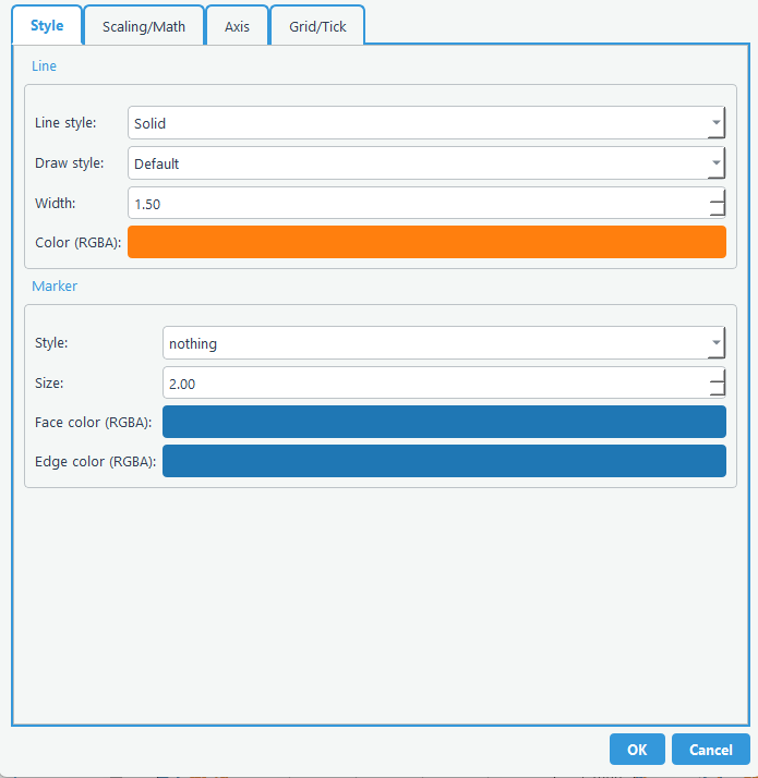
Q2. Can the traffic light color be set?
You can change the graph style by double-clicking the graph you want to change.