
There are many situations where you want to check the experimental results of 3D data such as fuel consumption maps using a contour plot, but Excel's contour plot function is often poor and difficult to use.
With Echart, you can quickly create 2D contours by simply loading data, specifying axes, and switching the display type. This article summarizes the specific steps for displaying 2D contours in Echart and some tips for making them easier to view.
Key points of this article
- Import Excel data and specify the header row (series name row) correctly.
- Load it into a 3D page and switch the display type to Contour
- Adjust the number of contour lines, labels, and whether or not to fill to create a look that suits your needs.
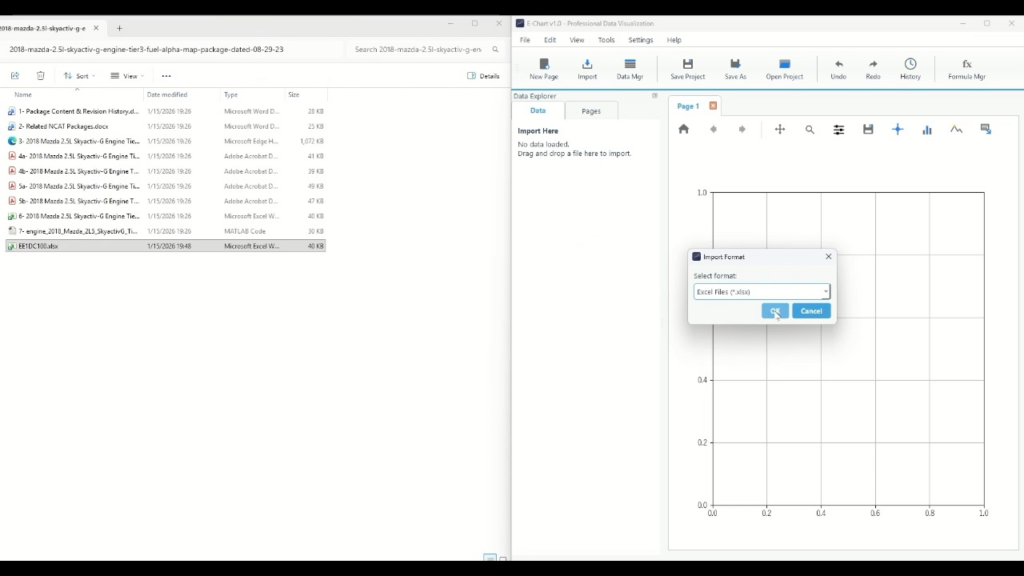
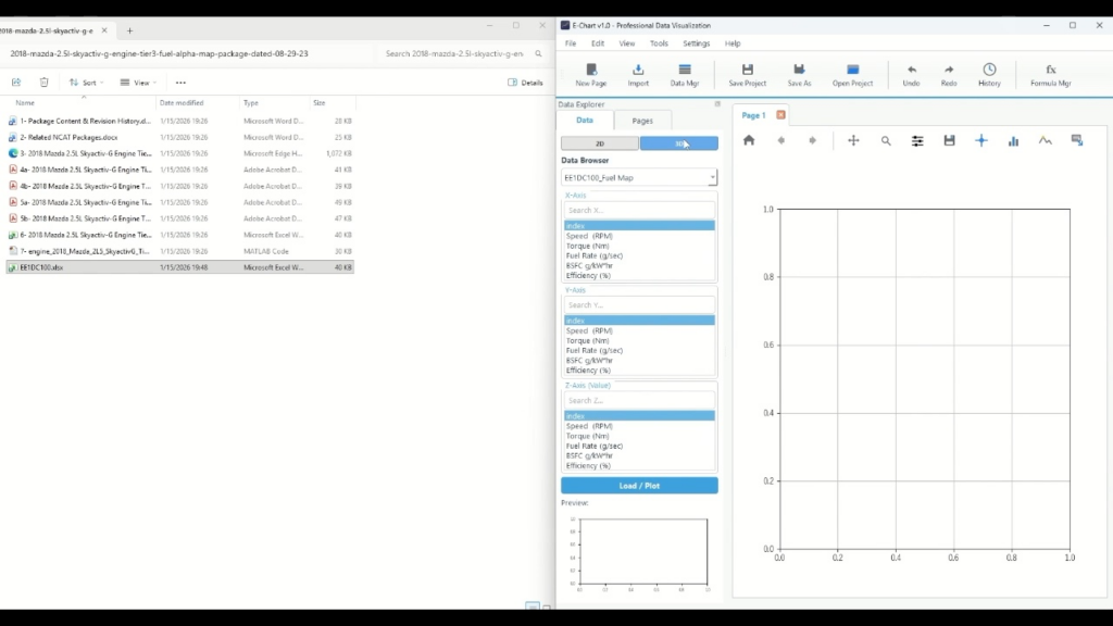
Step 1: Import the Excel file
First, load the experimental data into Echart. The experimental data is assumed to be in a format where data labels are arranged in columns and data values are arranged in rows.
- Select the target data format from Import in Echart. In this case, the data is in Excel format, so select .xlsx format.
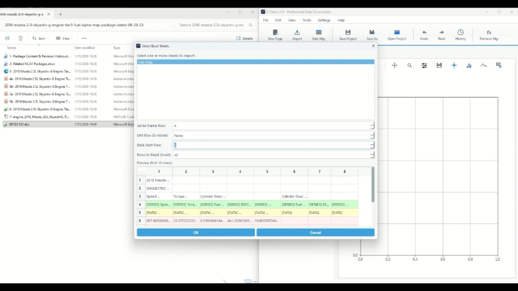
- On the sheet selection screen, select the target sheet (e.g., Fuel Map)
- Match the Series Name Row (header row) to the row containing the column names (changed to "4" in the video)
- Data Start Row should be aligned to the next row of the header. If there is no problem with the automatic setting, you can leave it as the default.
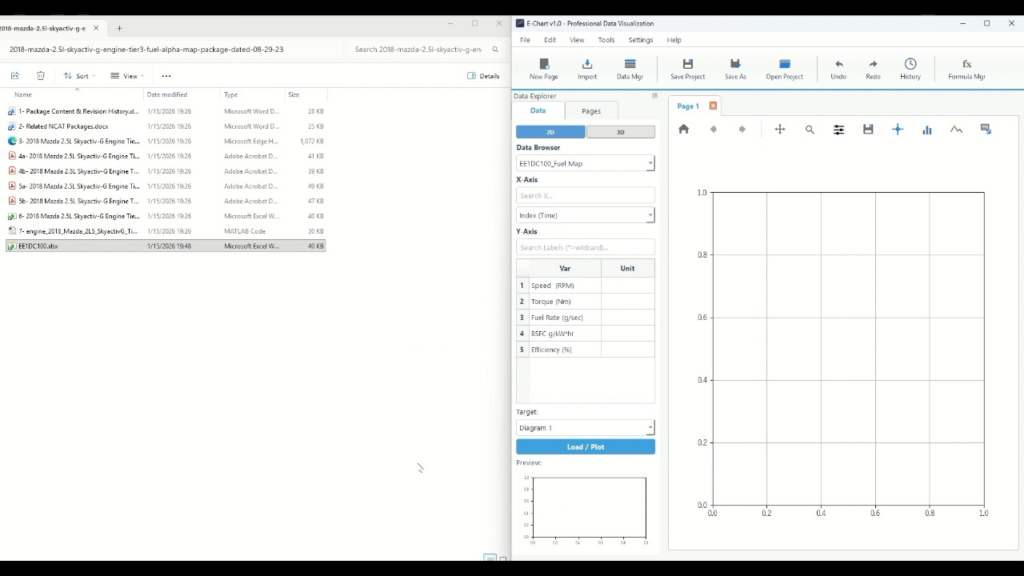
After loading, if the data items are listed in the data list, the import is complete.
Step 2: Assigning axes as 3D data
- Switch the data display to "3D" (3D switch at the top of the screen)
- In Axis Assignment, select XYZ axis data, where Z axis corresponds to the color map value.
- This time, we want to create a map of fuel efficiency against rotation and torque, so specify it as follows (replace the names according to the data):
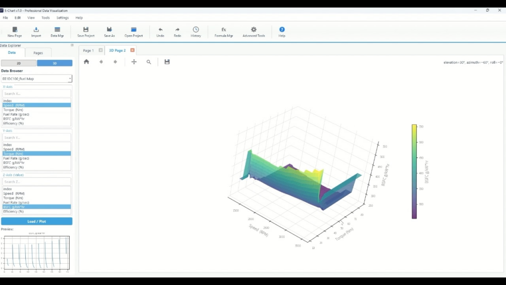
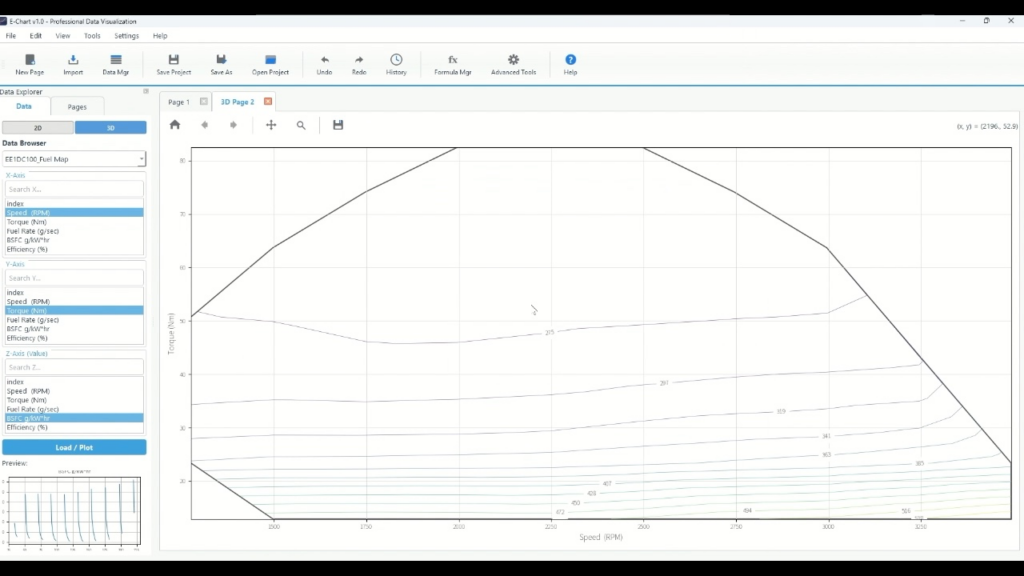
Step 3: Create and view a 3D page
Next, create a 3D page to draw on. The default graph area is set to 2D plot, so switch to 3D and create a new page.
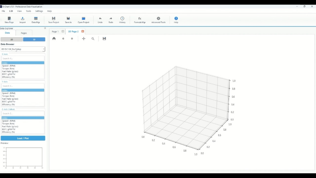
- Add a "3D Page" by creating a new page (3D Page will be added to the tab)
- Execute Load/Plot to confirm that the surface is displayed.
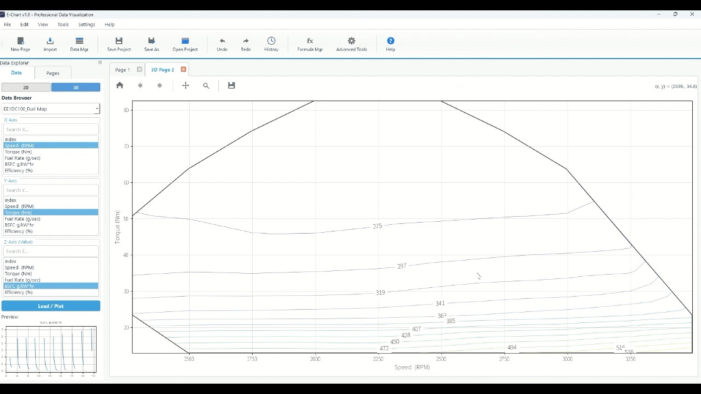
Step 4: Switch to 2D Contours
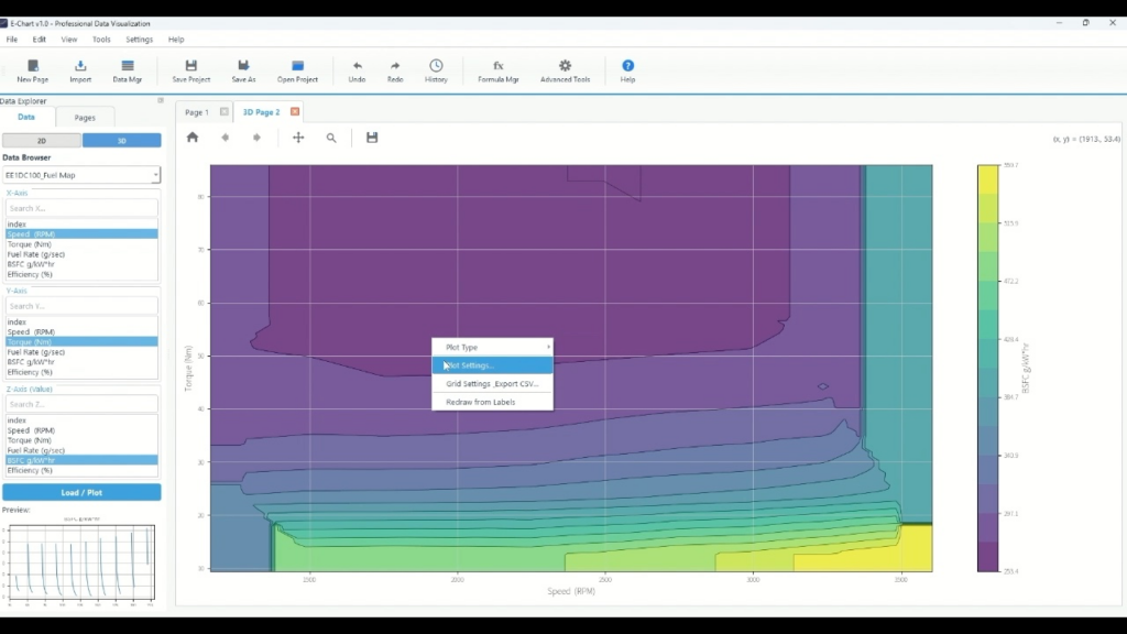
To display 2D contours, change the plot type to Contour. In the video, right-click on the plot to switch the display type.
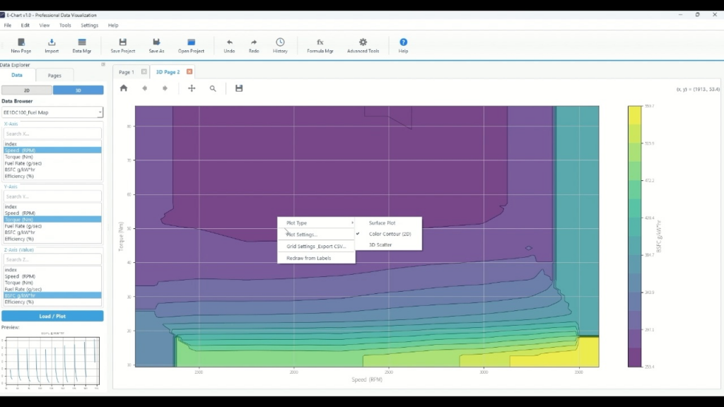
- Right-click on the 3D plot
- Select "Contour" from Plot Type
- Once the contours are filled in, the switch is complete.
Step 5: Adjust the appearance with Plot Settings
This is the "finishing the look" phase. In the video, we open the Plot Settings and adjust the borders, labels, and color representation in that order.
5-1: Open Plot Settings
- Right-click on the plot
- Click “Plot Settings…” from the menu that appears.
For subsequent operations, click on the items in the Plot Settings to switch between them.
5-2: Turn on Contour Labels
Labeling makes the contour numbers easier to read.
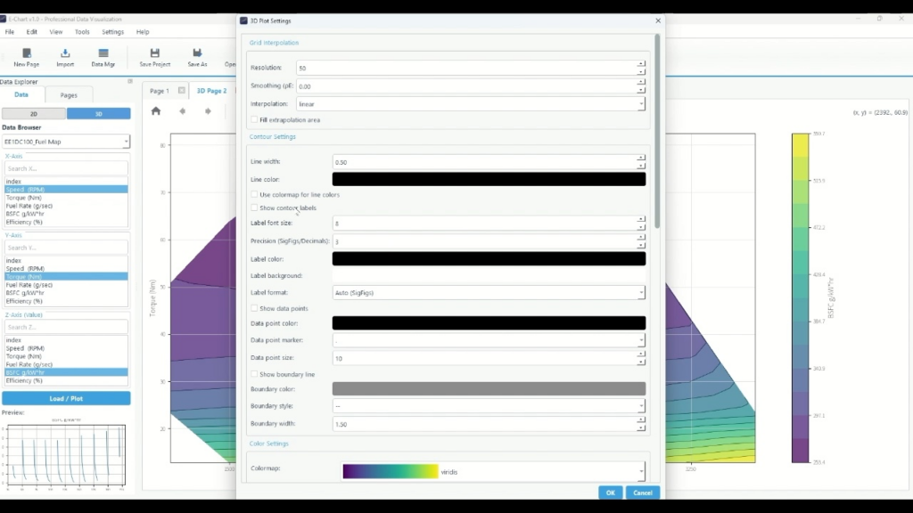
- Find "Contour Settings" in Plot Settings
- Click the checkbox for "Show contour labels"
- Label font size : Click the number and enter a size (e.g. leave it at 8)
- Precision (SigFigs/Decimals) : Click and enter the number of digits (in the video it is "3")
- Label format : Click the dropdown and select Auto (SigFigs) or other options.
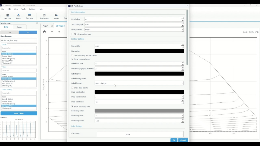
5-3: Display the boundary line (boundary of the effective area)
If you want to clearly show the boundary between the range where the measurement points exist and the range expanded by interpolation, displaying the boundary line is effective. In the video, the boundary line is turned on.
- In the Plot Settings, look for "Show boundary line"
- Click the checkbox to turn it on
- Continue by clicking below to adjust as needed
- Boundary width : Click the number field and enter the thickness
- Boundary style : Click the dropdown to select the line style.
5-4: Adjust the colormap (color scheme), number of steps, and transparency
The readability of the filled contours can change significantly depending on the color and number of steps. By default, viridis is selected as the colormap, and the number of steps and transparency are adjusted.
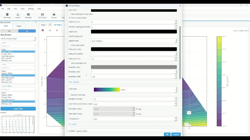
- Find "Color Settings" in Plot Settings
- You can click the "Colormap" dropdown and select your preferred color scheme.
- If necessary, you can click "Reverse colormap" to reverse the direction of the shading.
- You can apply a color map to the post lines by selecting Use color map for line colors.
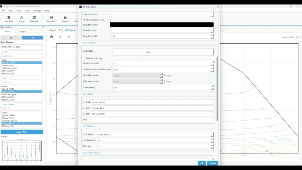
As an example, we will select "None" to set the color map to have no fill and the posting lines to be displayed as a color map.
Next, adjust the display of the data.
- Click "Number of levels" and enter the number of levels.
- Click "Transparency" and enter the transparency.
- To fix Min/Max (vmin/vmax) , click the numerical field and enter it. If you want to set it automatically, leave it as Auto.
- You can adjust the font size of the graph by adjusting the Axis Label size .
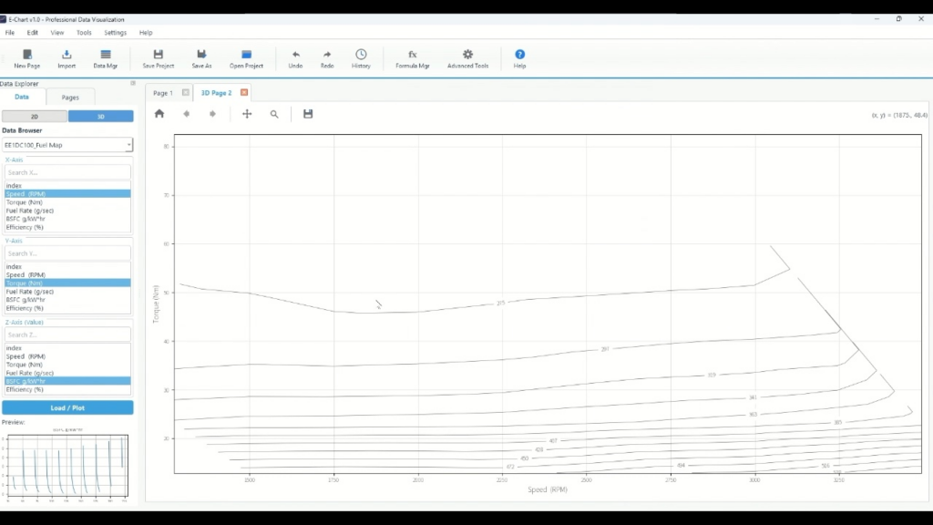
5-5: Check the reflected results
Once the settings are reflected,
- No colormap
- Contour lines are displayed as a color map
- With outer line
A 2D contour graph set to appears.
summary
- Match the header row (Series Name Row) when importing from Excel
- Draw on the 3D page, right click and go to Contour Display and Appearance Settings
- Adjust label display, border, color scheme, number of columns, and transparency in Plot Settings.
Echart is a data organization tool that allows you to easily import data, visualize it, and adjust its appearance. Our Echart introduction page also summarizes how to use it for different purposes. Start with a free trial and see if you can visualize your data using the same steps.
Plotting graphs using time series data reduction software
What is Echart?
Echart is a data reduction software designed to simplify time series data processing.
If you find it tedious to create graphs of time series data in Excel, try out Echart's easy plotting features with the free trial version.
All features are available free of charge for 30 days.