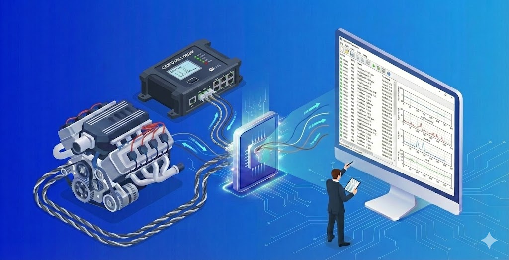
CAN data requires frame decoding (signal conversion) and the plotting of large time series, making it necessary to analyze it using dedicated tools such as CANalyzer. However, dedicated tools like CANalyzer are expensive and can be difficult to operate when reviewing data. With Echart, you can quickly visualize signal changes over time by simply specifying and importing the CAN log and DBC. In this article, we will explain the steps from loading ASC+DBC data to graph display in terms of on-screen operations.
Key point: Import ASC, select DBC, and plot Time_CAN as the horizontal axis.
The process for visualizing CAN data in Echart is as follows:
- Load ASC (CAN log) (drag and drop or specify via Import)
- Check the import format and select it if necessary.
- Select a DBC file and decode it to a signal
- Select Time_CAN [s] on the X axis and the signal you want to display on the Y axis and plot it.
Preparation: Prepare ASC (CAN log) and DBC (signal definition)
To convert a CAN log into a meaningful signal in Echart, you generally need two things:
- ASC file (other text format files are also acceptable): CAN log (e.g., Vector format log)
- DBC file : Signal definitions such as ID, bit arrangement, scale, etc.
If the DBC does not match the log, it can lead to symptoms such as signal names not appearing as expected or values becoming unnatural. The first step is to prepare a DBC that matches the target ECU and target bus.
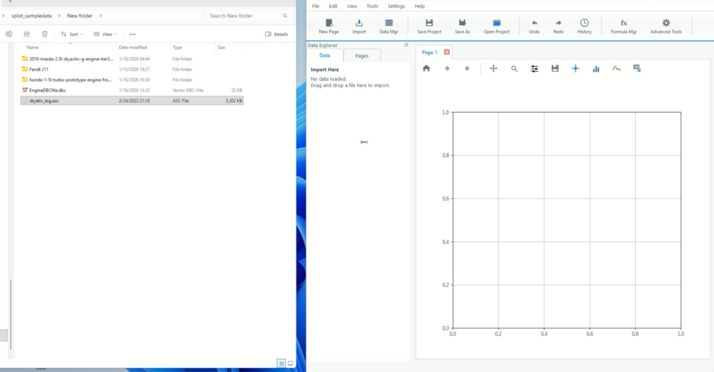
Step 1: Load the ASC (CAN log)
You can load files either by drag and drop or from the top menu. Choose the method that best suits your operation.
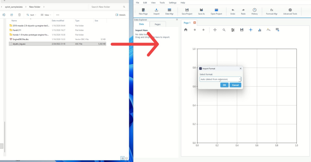
1-1. Importing by drag and drop
- Drag and drop the ASC file into the Import Here area in the center of the screen.
- When the Import Format appears, check the contents.
1-2. Load from Import
This is useful if you want to unify operations using menus rather than drag and drop.
- Select Import from the top menu
- Specify the file (ASC) you want to read.
- When Import Format appears, confirm the format and proceed.
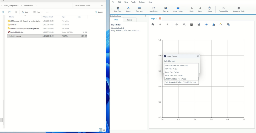
Step 2: Check the format in Import Format and then select DBC
2-1. Select the format in Import Format
- Check the Select format in the Import Format dialog
- If the format is automatically detected, proceed.
- If discrimination is unstable, explicitly choose a format that matches ASC.
It is possible to use files with extensions other than ASC. Please contact the Echart support team and we will provide a free update.
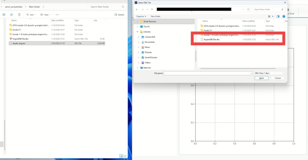
2-2. Select the DBC file
Specify DBC to treat ASC as a "signal".
- When the DBC selection screen (Select DBC File) appears, select the target DBC.
- After selection, the loading process will begin.
Step 3: Once the decoding process is complete, select the signal and visualize it.
As the loading progresses, the dataset creation (final processing) will run. Once complete, Time_CAN and the signal list will be available.
3-1. Check that the import process is complete
- Wait until the processing status on the screen (e.g., Finalizing dataset) is finished.
- Once the signal names are listed in the data browser, you can proceed to visualization. Please be patient as it takes some time to decode the CAN signals.
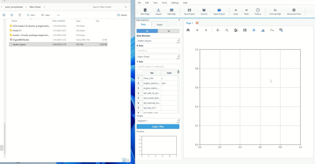
3-2. Set the X axis to Time_CAN and select a signal for Y.
- Open the Data Browser on the right
- Specify Time_CAN [s] for X-Axis
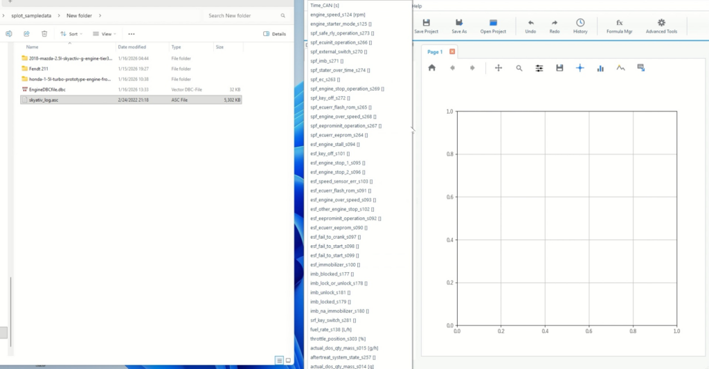
- Check the signals you want to display on the Y-Axis side.
- Optionally, use Search Labels (*=wildcard) to narrow down the search by signal name
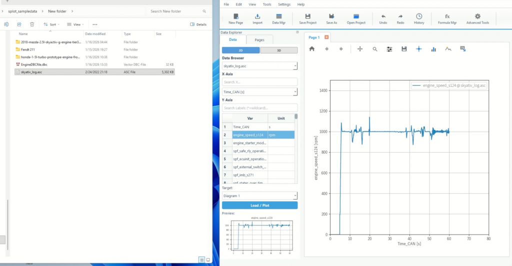
3-3. Finalize the plot
Once you select a signal, the preview will update, and if it looks the way you want it, you can just click on the plot to confirm.
- Time_CAN is on the horizontal axis
- The desired signal is selected.
- If the display is slow, reduce the number of signals and increase them gradually.
Common stumbling blocks and how to deal with them
Signal name is not displayed/value is unnatural
- The DBC version and target bus may not match.
- First, replace the DBC with the correct one and reload .
I can't find Time_CAN
- Dataset creation may not be complete
- Once the processing has settled down, check the X-Axis candidates in Data Browser.
There are so many signals it's hard to find
- Use Search Labels (*=wildcard) to narrow down your search results by partial match
- For example, you can include a wildcard like
*rpm*to quickly narrow down the results.
Summary: Echart allows you to analyze Can data without using CANalyzer.
- In Echart, you can specify ASC (CAN log) + DBC (signal definition) to decode it into a signal.
- Simply set Time_CAN [s] as the horizontal axis and select the signal you want to display to visualize the time series.
- If there are many signals, search, and if the values are unnatural, review the DBC.
Visualizing CAN logs, which is difficult to handle in Excel, can be done with Echart, which shortens the distance from import to plot. It is effective to start by displaying only representative signals, and then increase the number of signals and display conditions as needed.
What is Echart?
Echart is a data organization tool that allows you to read, visualize, format, and analyze data on a single screen. The import flow according to file format and the operation design centered on axis and signal selection make it possible to quickly start visualization.
A free trial is also available, so we recommend that you first try recreating the process from loading to plotting using your ASC and DBC to check the operation feel.
All features are available free of charge for 30 days.