
There are many situations where you want to open INCA measurement data (equivalent to MDF3 .dat) and quickly check only the signals you need in a graph. However, INCA and the MDF3 analysis software MDA are expensive and require a lot of time and effort to create a graph.
With Echart, you can quickly visualize your data by simply loading a file and selecting the axes and signals. This article summarizes the specific steps to load an INCA MDF (.dat) file into Echart and display the first graph.
To load INCA MDF (*.dat), click "Drag and drop → Select data → Load"
The process for handling INCA MDF (.dat) files in Echart is simple. First, drag and drop the file onto the "Import Here" screen, and if necessary, select "INCA MDF Files (.dat)" in the Import Format. Next, select the X-axis (time) and Y-axis (signal), and then click "Load / Plot" to plot.
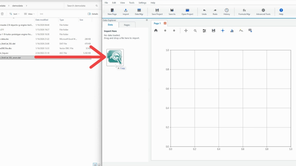
Step 1: Drag and drop *.dat (INCA MDF) into "Import Here"
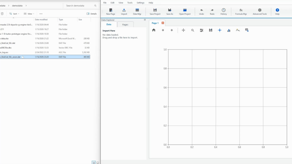
First, check the import area in the "Data Explorer" on the left side of Echart. If no data has been loaded, it will say "Import Here" and wait for the file to be imported.
Grab the INCA measurement file (*.dat) in Explorer and drop it directly into "Import Here" in Echart. The file icon follows the file while you drag it, making it easy to see where you are dropping it.
Supplement: You can also import it from "Import" on the ribbon.
In environments where drag and drop is difficult, you can also import files by selecting "Import" from the top ribbon. The basic process (select format → select variables → draw) is the same.
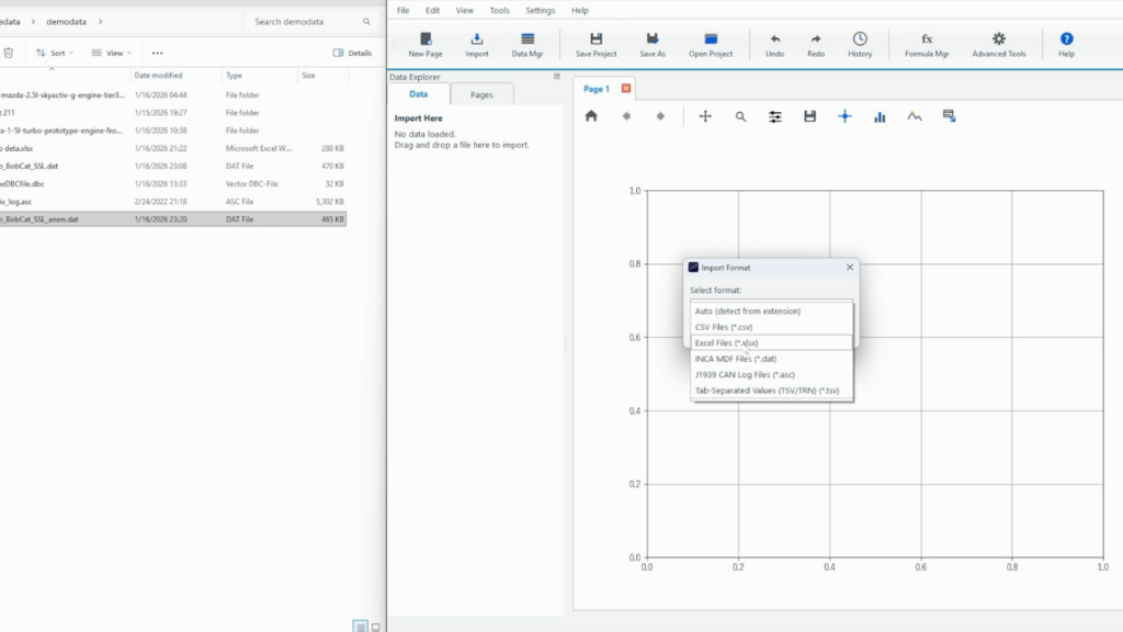
Step 2: Decide the format in "Import Format"
Here, open the drop-down menu and select the import format from the options. "INCA MDF Files (.dat)" will appear as a candidate, so you can select it as the format for INCA .dat files.
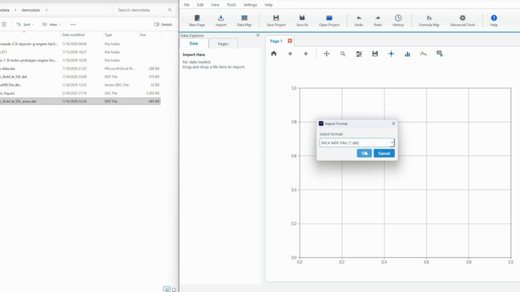
Select "INCA MDF Files (*.dat)" and press "OK" to confirm the import.
Step 3: After loading, select the X and Y axes in the Data Browser
Once loading is complete, the loaded file name will be displayed in the "Data Browser" of Data Explorer, and a list of signals (variables) will be displayed.
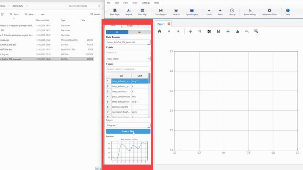
Select the X-axis in the "X-Axis" field. Here, select index(Time) as an example.
Although the sampling period for each INCA measurement data is different, Echart interpolates the data period for each sampling period during the import stage and displays the data automatically converted into a unified time series. Therefore, by placing the index on the X-axis, a graph for the correct time can be displayed.
If necessary, use "Search X…" to narrow down the list to the variable name you want to use on the X axis.
Select the Y-axis from the list (Var / Unit) in the "Y-Axis" column. If there are many variables, searching with "Search Labels (*=wildcard)…" will make it easier to find the desired signal.
The unit is also displayed, which is useful when there are multiple variables with similar names.
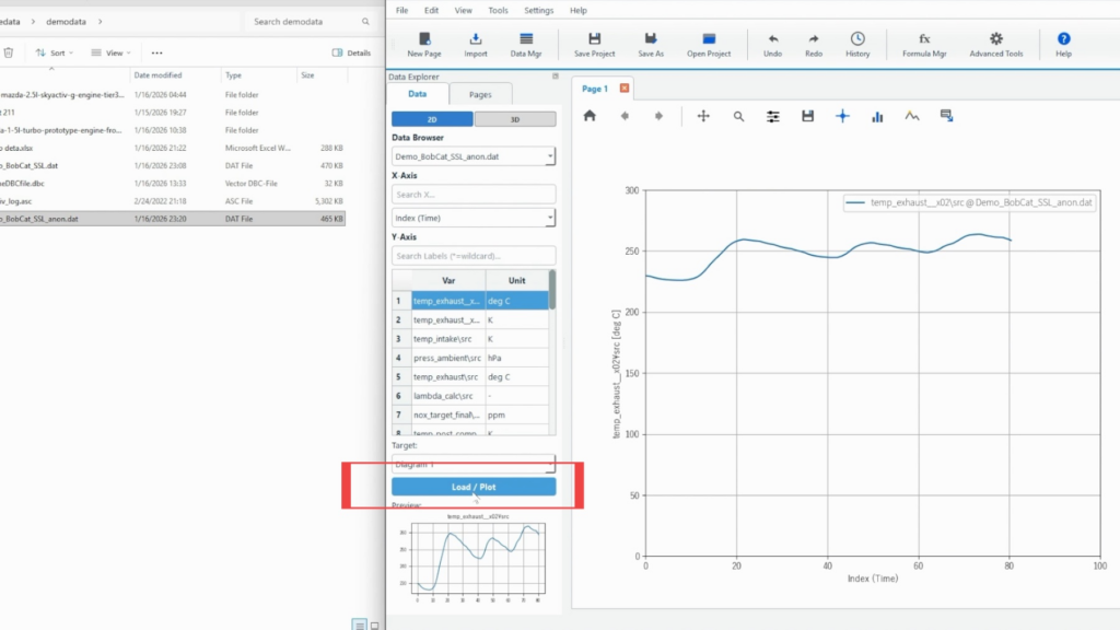
Step 4: Decide the drawing destination (Target) and display it with "Load / Plot"
Specify which frame to draw in with "Target". Since only one graph is displayed this time, select "Diagram 1".
Select the signal and check the target, then click "Load / Plot" to plot.
Once the drawing is complete, the selected signal will be displayed as a graph, and the data name will be displayed in the legend in the format "Variable Name @ File Name".
Checkpoints when loading is not successful
The currently supported data format is the MDF3 binary format. If the data labels are not lined up, please check the binary format of the measurement data.
If you have data in a format other than MDF3, please contact Echart support. We will support you free of charge until your data can be graphed.
Summary: Visualizing INCA MDF (*.dat) is easy with Echart
The procedure for importing INCA MDF (*.dat) into Echart is simple: (1) drop it into Import Here, (2) check the format with Import Format, (3) select the X-Axis/Y-Axis, and (4) plot it with Load/Plot.
It is suitable for operations where the first signal is sent out quickly, and then the necessary signals are added and adjusted.
Echart is a data organization tool for quickly visualizing measurement and experimental data. Start with a free trial and see how much smoother it is for organizing your INCA measurement data compared to MDA.
What is Echart?
Echart is a data reduction software designed to simplify time series data processing.
If you find it tedious to create graphs of time series data in Excel, try out Echart's easy plotting features with the free trial version.
All features are available free of charge for 30 days.